We first met fashion illustrator Michael Hak at Toronto Fashion Week. It was mid-March, and Canada’s most fashionable people were cutting through David Pecaut Square in their best or most outrageous outfits. Some stopped to pose for street style photographers or chat with friends, while others quickly beelined for the big white tent.
After finishing his workday as a visual merchandiser, Hak made his way to the square every day. To practice, he quickly drew the people he saw on the transit and sidewalks. Upon arrival, he stood in the circus of activity, dressed in a Donna Karan leather pea coat with an iPad Pro in hand.
Each look was digitally sketched. Throughout the week, he illustrated more than 80 people, four of whom happened to be FAJO team members.
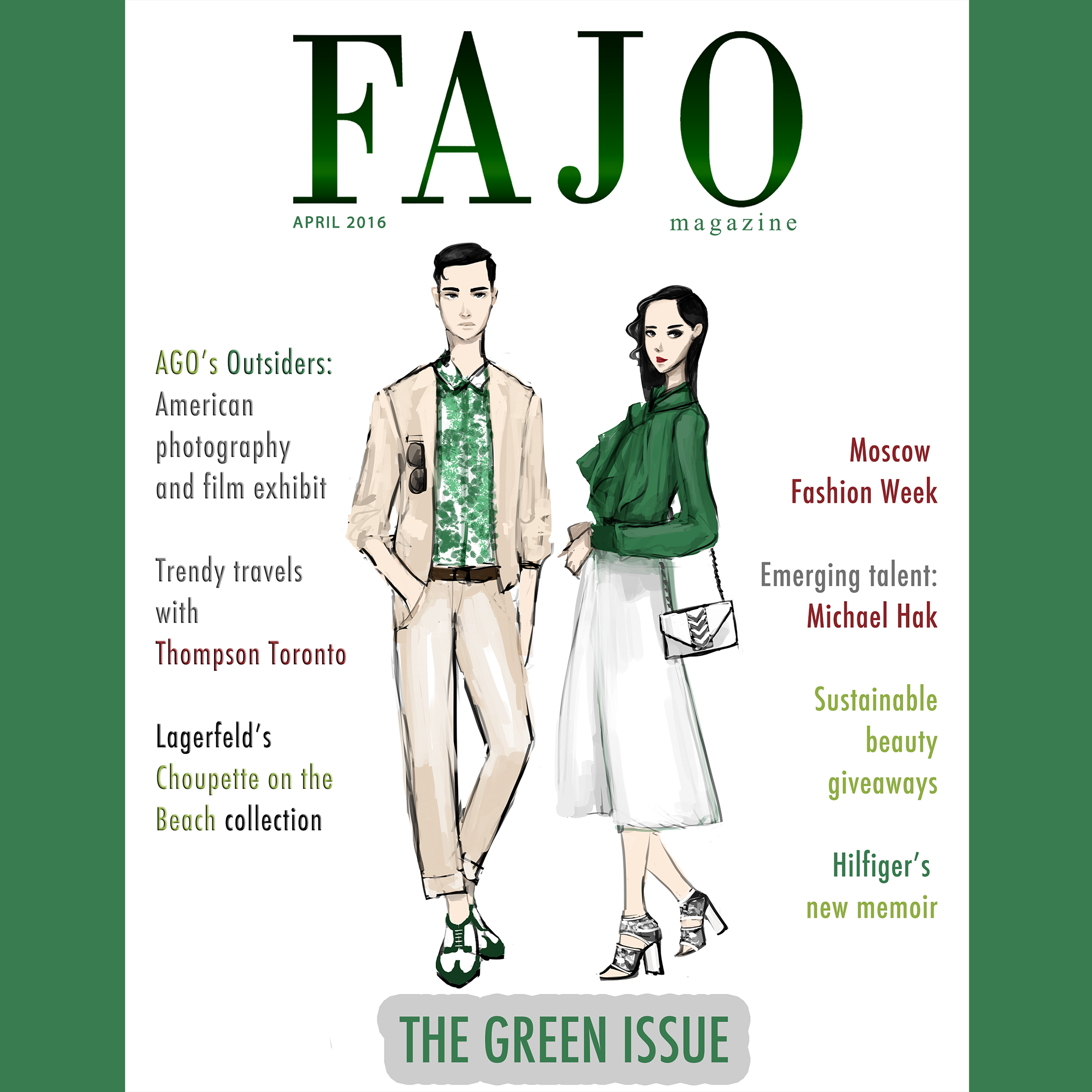
Shortly afterwards, we reached out to Hak and collaborated with him to create a special cover for The Green Issue. The focus this month is on sustainable fashion and beauty, so Hak created a chic, clean design.
We caught up with him to chat about the cover and his approach to illustrating fashion.

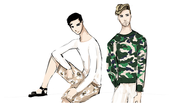
For The Green Issue, Hak created several exclusive illustrations for FAJO, including the one on the cover.
You created this month’s lovely cover and also four other illustrations that will be unveiled on FAJO’s social media pages throughout the month. What was the inspiration for the cover artwork and how did it translate into the final piece?
When I was talking to [FAJO’s Editor-in-Chief] Hannah, she told me about [The Green Issue]. I love the idea of a Green Issue and anything environmental. I really wanted to go with a minimalistic feel, so I tried to pull looks that were current and trendy.
Did you design the outfits?
No, they’re existing looks that I pulled. For example, the ruffle top is from Gucci’s current season.
I also wanted to make sure there were Canadian pieces mixed with international brand names that would all fall under the umbrella of green [and] neutral tones.
Who are some of the Canadian designers you got inspired by?
Mackage, Rudsak and Pink Tartan.
You used an iPad Pro to create the designs. Could you talk about the digitization of illustrations and how that affects your work?
I’m a studio-trained artist, so I know the basics: watercolor, acrylics and what not. I see digital as an extension of what I can do. For me, [it’s convenient] how there isn’t much to prepare and you can get a similar aesthetic as traditional mediums. When people think “digital” they think very un-organic, but the way I approach it is a bit more “painterly.”
What is your educational background?
I attended Sheridan College in Oakville for Art Fundamentals for a year. It was a very watered down kind of program: we were doing sculpture for a month, then drafting, then graphic design. Just the bare basics.
During TFW, what was your process for illustrating street styles?
I would go up to anyone who I thought had an appealing sense of style and quickly take their picture for future reference, in case I didn’t finish the illustration or they had to leave. It’s quite unpractical to do street style sketching and ask them to stand there for 10 minutes for you to draw.
Then, kind of creepishly, I would walk around in front of the tent and study their body language. In all my street style sketches, you can see the subject’s personality.
In that case, for our cover this month, how did you create a personality and body language for the female character, for example?
I just thought of a very classic, retro kind of girl. Really feminine pose. It’s almost like I have a rolodex of poses in my head and that one just came naturally to me. Especially when she was interacting with a guy for the cover illustration.
You have mentioned to us that you are colourblind. Looking at your illustrations I would never guess you had any difficulty seeing or interpreting colours.
Usually people are surprised. I tell people I read colour in context. For example, if I see a guy walking down the street in a purple shirt, because purple and blue look really similar to me, I will automatically assume he’s wearing a blue shirt. Only because, blue is a little bit more neutral.
What made you choose art?
You know, I was really fascinated with the whole idea of interpreting things. As corny and cliché as it may seem, I drew a lot of love and admiration from the cartoons I watched as a kid, namely Sailor Moon. I loved that show as a kid; it was my favourite thing in the world.
Even to this day, I think that animation, fluidity and movement are huge defining moments in my life, and I attribute them to a lot of my aesthetics.
For this article we asked you to draw a self-portrait. Since you usually draw others, what was it like to illustrate yourself?
It’s funny you should mention that: it was tough to do! I had three self-portraits I worked on. It’s a bit personal for me because I don’t like to put myself in the spotlight too much. I like to be more behind the scenes and basically not exist. (laughs)

Hak’s self-illustration.
I look forward to seeing the final piece then. And what projects are you working on now or have coming up in the near future?
Right now, I want to work on my Instagram and build a fan base.
There are some ideas I have in my mind in terms of fashion illustrations and something that I think will set me apart from other illustrators. Something that I don’t really see in a very strong classical animation [is a] take on fashion. I actually love frame by frame. I’m just going to take it back to Sailor Moon once again: I thought it was so beautiful when she’s transforming, it’s mesmerizing.
That’s something I want to take my illustrations to the next level with. It will be a matter of self-training and seeing what programs will work for me because animation is a huge undertaking. For example, on my Instagram, there is a frame by frame of a girl walking and it’s probably only five seconds but it was around 90 drawings.
All illustrations by Michael Hak.
Stay tuned for the unveiling of the other designs he created for us: all to be published on our Instagram page this month!


[…] The most packed area of their lounge was sponsored by hr2 Holt Renfrew, and had illustrators Michael Hak and Stephanie McKay doing watercolour fashion illustrations of the guests. Anyone who posted a […]